Blog 55
Hello
Everyone,
Tomorrow is my final deadline, this
is where I hand in my finished work so I was doing some last minute things e.g
changing font colour and I decided I don’t like having Hilly on my front cover
and I want my original model who is “Lily Rose” to be on the front cover.
Luckily I had taken some close ups of her at the photo-shoot in case I wanted
to use them.
Front Cover 1 Front Cover 2
Both
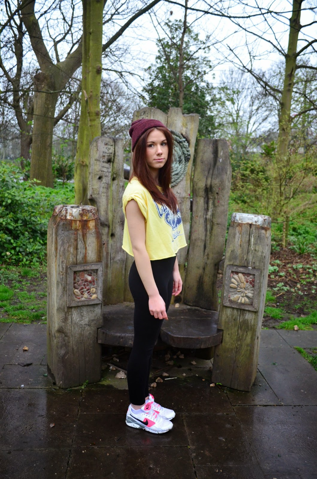
front covers have positives and negatives. Front cover 1 with Hilly on has a
good balanced layout with her being exactly in the centre and where the titles
are positioned. However, the photograph itself isn’t conventional as not one of
my style models has an image on the cover where you can see their feet. She
feels very far away therefore isn’t connecting with the reader. However, Front
cover 2 with Ellie as “Lily Rose” on is conventional as 3 out 5 of the front
covers I analysed have either a close up or an extreme close up. This really
connects with the audience as you can clearly see the model/artist looking into
the lens and it feels like they’re looking at you.
Hillys
front cover is conventional as I have placed the list of artists on the left
which is what the ones I have analysed that have a list of other artists have
it on the left and Ellie’s cover is challenging that as I have them on the
left.
The
image of Ellie on front cover 2 is A LOT brighter, it was a sunnier day and I’ve
edited it better which automatically makes it look happier and more exciting
and attracts the reader a lot more because if it was on shelves in a shop it
would stand out 10x more than Hillys cover.
I
like both images but I much prefer the layout of front cover 2 with my model
Ellie as “Lily Rose” as it’s brighter and a lot more eye-catching and happy. Also
front cover 2 is more conventional than front cover 1 as it has the close up a
larger barcode with a white box around it making it readable and the text is
better placed and easier to read. Therefore I am using front cover 2 for my
final cut.


