Monday, 31 March 2014

Update 5

Blog 35
Hello Everyone,
          I haven’t posted in a couple of days and this is going to be super small because all I have been doing is tweaking a few things that I thought needed changing (e.g. Font colours/sizes) before a get my target audience feedback which I will do a post on once I receive it. 

Friday, 28 March 2014

Photoshoot 5

Blog 34
Hello Everyone,
           Today, I did a photoshoot with my friend Joanne for my contents page image. I decided to take her to the beach to take some photos and I found a perfect spot on the promenade. There’s a rusty barrier which I think looks like something you would find on tumblr, and you can see for miles out to sea. Also the rocks and nice weather just make the photo look really nice.
I asked my model to wear a band Tee as you often see in NME’s artists wearing other artists merchandise, so I decided to have her wear some. This attracts more readers because if an artist they haven’t really heard a lot of is wearing their favourite artists merchandise it might make them think their music is similar and want to know more about them.


Wednesday, 26 March 2014

Double Page Spread First Draft

Blog 33
Hello Everyone,
               My last 2 posts have been talking about my first drafts and so today I am going to be talking about the final draft of my double page spread. Today is the date of my rough cut where I will be receiving feedback from my target audience and peers.


The layout of my double page spread is 50/50. The left is an A4 image the right side is the article. I chose this style because it makes the image stand out and the colours draw the reader into the article. Also with the article being on a white background it is really easy to read.
The article itself is 3 columns talking about who “Lily Rose” is and how she got into music. I think I’m going to include a Q&A aswell as info about her.
At the bottom right corner of the page I have 3 smaller images of “Lily Rose” in a pink squares with space underneath small quote from her. This makes the page look slightly busier and breaks up the divide between the image and the article. 
I am going to be editing my article as this is just my first draft and taking some new images (as my models currently in a garden and you can see a plant pot in the image)

Hopefully, by the final cut my double page spread will have massively improved. 

Tuesday, 25 March 2014

Photoshoot 4

Blog 32
Hello Everyone,
         Today I did a photoshoot for my contents page with my model Hannah. I wanted to use a guitar in her images because she looks very much like a singer songwriter which is what Q often writes about. I wanted Hannah to look like she really only cares about the music. I took inspiration from the images in Ed Sheeran’s double page spread image. He’s dressed just in jeans and a simple jacket with his guitar. This gives the impression he doesn’t care about fancy expensive clothes because he loves what he’s doing which is playing music. This is the impression I wanted to give of Hannah, that she’s not focused on the fame just the music.
So she’s wearing a very casual black jacket with some blue denim jeans. I also asked her to wear a daisy/floral top to have a connection with the genre.

I took some photos inside and outside for different possibilities for my contents page. 


Contents Page First Draft

Blog 31
Hello Everyone,
            So in my last post I talked about my finished draft of my front cover, so today I am going to be talking about my finished draft of my contents page. The style model I used for my contents page is NME’s contents page. I really like the layout so I decided to make my own version of it.


 The title “in this issue” is two different fonts. I decided to make “Issue” a lot bolder as that is something NME does. Also I didn’t want the title to be “Contents” I don’t think it reflects my indie alternative genre and its very simple and often used so I decided to think of something else.
I have one main image in the centre of the page. This draws the reader to them, in a real magazine they would probably have a double page spread but I decided I didn’t want to do my  main article on a group so I’ve written it on “Lily Rose”  who is on my front cover.
I also have 6 other stories and images along the sides. The blocky square look makes the page look neat and ordered. I have chosen a mixture of in the studio and on location images as it makes the page look more exciting. If all the photos were in the studio it would just look the same. 
Each image has a small caption, within these captions there is a quote from the artist and a brief sentence suggesting what’s in the article.
At the bottom of the page there is a “Vinyl Review” section, these are lists of artists which would be reviewed within the magazine.
Finally in the bottom right corner there is a red outlined box that is a subscription advert.
I am going to be re-taking some of my images for my final cut. 


Monday, 24 March 2014

Front Cover First Draft

Blog 30
Hello Everyone,
       Today, I made my first draft of my front cover. My model Ellie was unable to go anywhere as we only had an hour so I took pictures in her garden. I will be re-taking my images of her in the next few weeks. (I’ll write a blog about the photo-shoot)
The image is very dominate and takes up the whole page, making my model (Lily Rose) stand out. She’s wearing the flower crown (mentioned in a previous blog)  
The font I used for “Lily Rose” and everything associated with her is called “Brain Flower” and I downloaded that from “Da font” (all of my fonts will be downloaded from Da font)
The main title of “Vinyl” is a sharp straight font unlike most of the other fonts also; it has a white outline which makes it stand out. I placed the title in the top left hand corner because both of my star models NME and Q have placed their titles there. I chose the name “Vinyl” because it’s linked to the music industry and is considered “vintage” so it links with my target audience.
The banner at the top offering a free poster is a slightly similar font as the one I used for the “Vinyl” title. I chose a similar font because it stands out and is very readable. I changed the colour of “poster” to yellow so that it stands out, also NME does this.
I don’t have a barcode made yet however I know where I want to place it so I wrote “barcode here” so that my feedback was helpful and wasn't just “You need a barcode” because I knew that.
Finally, the side bar which I have put other bands names that will be included inside the magazine. I included artists such as; Arctic Monkeys, Jake Bugg and Lana Del Ray etc, as they all link to my genre so will appeal to my audience.


I am aware it needs a lot of work, and hopefully my feedback will help me improve it.

Sunday, 23 March 2014

Update 4

Blog 29
Hello Everyone,

               Today, I have been completing my first draft of my front cover. I am going to write a blog post about it probably tomorrow. It is only a first draft so by the end of the project there will have been lots of changes. My rough cut is in 3 days. This is where I receive a lot of feedback from my target audience about what they like and what they want me to improve.

Saturday, 22 March 2014

Photoshoot 3

Blog 28
Hello Everyone
              Today I did another photoshoot for my contents page this time with Hilly, Amy and Catherine as my models. I chose to have 3 girls in a group as I got inspiration from groups such as Stooshie and HIAM. My models came into the studio in bright colours and all looking slightly different.


Thursday, 20 March 2014

Photoshoot 2

Blog 27
Hello Everyone,
        Today, I did a photo shoot in the studio with my model for my contents page. For all my photo-shoots I am using a Canon camera which is a good camera which produces quality images. I used the manual settings to change the shutter speed editing how much light is allowed in the photo. Also, I can change the focus and zoom using the lens settings.
 I am going to Photoshop all of my images so that they stand out from the backgrounds and has a professional look to them. On my contents page I have 7 images. Some are on location e.g. the beach

My model Joe came into the studio and I decided I wanted him to wear something smart but also casual (smart casual if you will) so he wore a white t-shirt and jeans with trainers but then wore a blue blazer. This look really works for my genre as male indie artists are often dressed this way e.g Charlie Fink from Noah & The Whale or Alex Turner


Wednesday, 19 March 2014

Target Audience Research

Blog 26
Hello Everyone
            I asked 20 people a series of questions:
“What attracts you to reading a music magazine?”
“What colours would you want to see in an indie magazine?”
“What articles do you like reading about? E.g. interviews”
“How much would you pay for a music magazine? 

  • £1-£2
  • £2.50-£3
  • £3.50-£4
  • £5+

“Any other things you would like to see”


From my research I found out:From my final question “Any other things you would like to see” and I got some suggestions of using quotes throughout, images on location and in the studio and including posters and free things.

From my target audience research I found out that most people are attracted to magazines by images of artists and interesting articles mentioned either on my contents or front cover and the article I will have must be interesting as well. Also I need to use pastel colours and bright colours as that is what most people said they wanted. Finally I found out that I need to charge about £2.50 for my magazine. My target audience research helped me decided what I wanted to include in my magazine.

Tuesday, 18 March 2014

Update 3

Blog 25
Hello Everyone,

         Today I was just tweaked my double page spread and began making my contents page and front cover, ready for the rough cut next week. 

Monday, 17 March 2014

Update 2

Blog 24
Hello Everyone,

      Nothing fancy today just a little update. My rough cut for my magazine when I get feedback from my target audience is on the 26th of March. So far I have made my double page spread and I’m currently in the middle of making my front cover. 

Flower Crown

Blog 23
Hello Everyone
             So in my previous “update” blog I mentioned that I would hopefully be doing something creative soon and well I have. I made a flower crown. Flower crowns link to my genre as artists such as Lana Del Ray often wear them in music videos etc. Also my Indie genre is associated with social media such as Tumblr and Pinterest and flower crowns are common on there.
I made the flower crown myself because the ones I saw in shops I didn’t really like as they didn’t match the pale colours that I wanted (As my target audience requested pale colours) I ordered Lilac, white and pale pink small flowers and some leaves off “Hobbycraft.co.uk” and it came to about £10. All I did was plait some string and wrap the wire around them.

The Flowers match my models blonde hair as it makes the colours stand out, whereas if I had used a brunette model the colours would have blended into the dark colour of brown hair. Also the light blue dress matches the pastel colour theme.


Sunday, 16 March 2014

MOJO Double Page Spread Analysis


Blog 22
Hello Everyone,
            Today is my final analysis ever! I am going to be analysing “The Last Shadow Puppets” MOJO double page spread. This double page spread is image dominated with the two members on either side of the article. The image is in black and white which makes the orange in the title and subheading stand out attracting the reader to the article. Also, with the article is in between Miles Kane and Alex Turner and flows over the page this attracts the reader as it’s in the centre of the page. The title is ombred from bold orange to white, this links with the title “Best of Both Worlds” as the colours represent the different “worlds”
There are no conventions I would consider using from this double page spread because the page is very dark as the colour scheme is black white and orange. Also the page is image dominated which makes it difficult to read on the white background. I would change this by either putting a white box around my article or changing the background of my image, to make the page brighter and the text readable.  

Saturday, 15 March 2014

Q Double Page Spread Analysis


Blog 21
Hello Everyone,
                 Today, I am going to analysis my final Q magazine, its the Lady Gaga issue. This double page spread is half and half, half image and half article. The image fills a whole A4 (half of the double page spread) this makes the artist stand out and shows she is of some significance. The image has been used to attract the male audience as she appears to wearing just a necklace and covering her breasts with her hands. Also in terms of the rule of thirds her face has an entire third for itself which draws the readers attention to her. The large red L draws the readers attention to the article, making them want to read it. Also the drop capitals within the article breaking it up instead of having a really long article filing the entire A4.

The conventions I would consider using from this double page spread would be the idea of it being half and half, which an image filling an entire A4 page and the article being on the other side, I like this because it is simple and the image and article stand out with all the text readable. The conventions I wouldn't consider using would be the use of a large letter filling my article because i think it makes the article difficult to read. 

Friday, 14 March 2014

Photoshoot

Blog 20
Hello Everyone

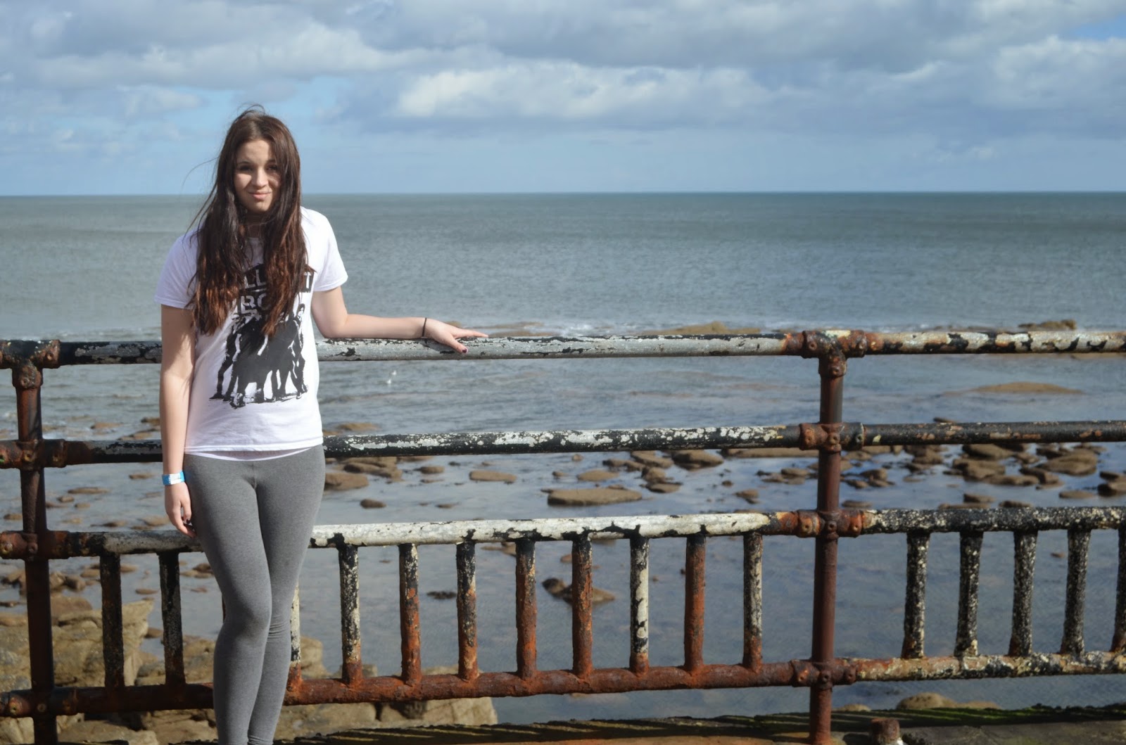
           Today I did a photo-shoot with my model that is going to be Lily Rose. She came into school where there was a “studio” set up so I could take pictures and Photoshop them afterwards. Ellie (my model) brought in a few different outfits so I could get a range of photos. Unlike my previous practice photos I used a professional camera (which I don’t know the name of) and the quality of the images was 100x better. 


 This is a photo of me editing the setting on the camera to improve the photo. I changed the shutter speed to allow more of less light into the image. I changed the focus and the zoom as a perfect image that I like isn't down to luck.
Since my magazine is called “Vinyl” I decided to use a vinyl in my photos to represent the magazine as a Trademark. The vinyl is very hipster/indie hence why I have used one in my magazine as that’s my genre and target audience. 


The outfits I chose for my model also represent the indie/singer songwriter genre as she’s in a skort with bright palm trees on, with a plain grey top on. I like this outfit because it’s plain with a little bit of detail, it does look slightly “poppy” but it reminds me of something Lana Del Rey would wear on a photo shoot. From research on tumblr and pintrest skort's are very indie and are often worn with a plain top or a plain skort. I knew I wanted to Ellie to wear a skort because they’re all over tumblr and really in fashion with hipsters/indie fans. 


My photos turned out really well and I love most of them, I took a range of different shots in different outfits here is just a few:


I took a long shot with her in a skort, grey top and denim jacket – with frayed shoulders with her black heels on. This outfit is nice and represents the genre through the skort but mostly the denim jacket as many hipsters wear oversized denim jackets and the frayed shoulders make it look edgy and quite quirky.
I decided to make her hold the vinyl over her face as she looks dramatic and secretive, this would be for the contents page so it would make the reader want to know more about her and why she’s hiding behind the vinyl or maybe she’s hiding behind her music as she’s afraid of the lime light. 


Here’s another example of her hiding behind the vinyl but she’s not completely behind it which shows that she is all about the music but also wants the fame side of the industry. I really like this photo as her outfit is very casual as you can only see her grey top, this shows she’s down to earth and just a normal human being.


The last outfit Ellie wore was her black skort and denim shirt, this outfit just screams fashion tumblr to me as its very casual and looks very indie, she was originally wearing her black heels but I decided she should put on my pink buckled ankle boots because aswell as the skorts they’re very tumblr and I did some research and found a lot of different styles and colours on tumblr and pintrest so I decided Ellie should wear them to create a very casual day time look, creating the same effect that Ed Sheeran’s double page spread image gives. 


Here is a short video I made on Windows Movie Maker showing some images from this shoot.

Thursday, 13 March 2014

Q Double Paqe Spread Analysis

Blog 19
Hello Everyone,
                Today I am going to be analysing Ed Sheeran’s Q double page spread. This double page spread is very bright and image heavy. The Image fills both pages and is separated by a large white box containing the article. The image itself if very nicely shot as it has Big Ben and the houses of Parliament in the background, this shows that Ed is from Britain as if an artist is American e.g. Lana Del Rey’s NME front cover. They’re shown with something e.g. an American flag showing they’re from America so Q has done this with Ed Sheeran’s double page spread but shown his British roots. Also, with his casual outfit of jeans and a hoodie (which is typical Ed Sheeran) he looks like a normal Londoner but with his guitar he appears to be busking which shows he’s more concerned about the music rather than the fame.
The conventions I would consider using from this double page spread would be that fact it’s on location, often photos are taken in the studio but the location makes the image have depth and meaning. Also I really like the large quote on the bottom of the image, it almost appears to be the title of the article (I don’t think I’ll have it as the title) but I would consider having a quote on the page somewhere. The conventions I wouldn’t consider using would be having a large box with the article written in it there’s just something I don’t like about it, even though it makes the article stand out against the image I just don’t like it so probably won’t use it. However, I like the drop capital and that indented quote, they draw the reader into the article and the indented quote breaks up the text making it look less like a large block of text encouraging the reader to read it.

Wednesday, 12 March 2014

Initial Sketches

Blog 18
Hello Everyone,
          Today I am going to talk about my initial sketches of what my first thoughts of how my magazine is going to eventually look. Just like to point out I'm not an artist I do not draw so don’t judge me. I'm unsure of what colours I want so I just tried a couple.

My front cover is going to be all about my main artist Lily Rose, so there is going to be a large image of her in the centre. I'm not going to make her head cover the title as no Q’s and only one NME (Last Shadow Puppets issue) I've analysed cover the title/logo it doesn't really fit the genre. My title isn't necessarily going to be blue I just wanted to see what it would look like. Also I really like the font its simple but looks quite different and edgy (basically indie music) Also I came up with the name “Vinyl” as it links to hipsters and to music also I think it has a nice ring to it. Sticking to the theme of   my artist next to the title in the top right corner I was going to put a quote from Lily Rose as it fills the page and also in Florence and the Machines issue of Q there’s a nice quote there. Finally along the side I am going to have a column that lets the reader know what other bands will be featured inside this issue. I am missing a barcode from my initial sketch; I will include a barcode in my final piece, maybe in the bottom left. 


For the contents page I didn't want to title it “contents” so I thought about having the title “In this Issue” or “This issue includes” just something different and quirky. The centre section is going to be dedicated to Lily Rose; there will be an image of my model and a quote.  I want a quote from each artist to put on the contents page next to their image. On the left side of the page I was thinking of putting images of artists in what looks like vinyl sleeves, as my magazine is called vinyl and it breaks it away from looking like a copy of NME’s contents page. Then on the right hand side just have boxes with artists in, this keeps it neat but also doesn't over do it on vinyl sleeves. At the bottom of the page I was thinking about having a more “serious” section which includes; a message from the editor thanking the reader for purchasing it. A small review section, of either someone reviewing the magazine or a short list of reviews included in the issue and a “sneak peak” at one. Finally in the bottom right corner I am going to include a small subscription advert informing the reader about how they can subscribe to the magazine.


Finally, for my double page spread I would like a large title in my sketch I chose “Sushi & Cigarettes” I chose this as it’s the name of her new album and is eye-catching, I didn't want to just have her name as the title because there will be an image of her on the left and she’ll be on the front cover so you will know who she is. I really like the font as again its very quirky and just reminds me of Tumblr when I look at it. I wanted to do 3 columns of text in my article but the size of the column getting slightly taller as the article goes on.  I want an indented quote somewhere within my article in my sketch I wrote that I wanted a quote above the first column I wouldn't mind it there but I may move it around and find a better place to put one. I haven’t drawn an image because like I said I can’t draw to save my life, but on the left hand side i would like an image of Lily Rose and it will bleed over the centre line as in Florence’s (previous post) the image of her bleeds over and its eve-catching and draws you to the article.

Tuesday, 11 March 2014

NME Double Paqe Spread Analysis 2


Blog 17
Hello Everyone,
     Today I am going to analysis another NME double page spread, this if a Florence & the Machine issue, in this issue Florence’s double page spread is based on her ambition to get take over America. She’s sitting on a white and red cloth which is based on the American flag. The title is a large “USA got the love” title is appealing as it tells us that Florence is going to be going over to USA with her music also; the “got to love” part of the title is lyrics to one of her most famous songs Got to love. The image is iconic as it sticks to the theme of USA but also the main features males are attracted to e.g. chest/breast are all in the same 3rd of the rule of thirds. This attracts the reader as they are drawn to her, also chest/breasts bottom and face are the main attractions of a person so they're placed in the same 3rd. Also her position is almost revealing with also attracts male and female audience. 

The conventions I would consider using would be the fact the image spills across on the centre line this makes the image and the artist stand out and fills a lot of the space. Also I like the 3 columns of writing in slightly different sizes it looks edgy and quirky and that fits with my theme. I really like this double page spread and I couldn't find anything that I know I wouldn't use.

Monday, 10 March 2014

NME Double Page Spread Analysis

Blog 16
Hello Everyone,
                Over the next couple of days I am going to be analysing 5 double page spreads, all of the double page spreads I have chosen are about solo artists since I am doing a solo artist I thought it would be beneficial as I feel the double page spread is going to be the most difficult. However, my project is starting to really kick off I'm sketching what my first thoughts about what my front cover, contents page and double page spreads are going to look like. Also, I'm going to be doing some target audience research. Busy busy busy. So there may be some posts about other things in-between my analysis.
So without further or do here’s my first analysis of Jake Bugg's NME double page spread. The double page is split in half with text on the left and an image on the right; this looks organised but other double paged spreads often overlap. The large title overlaps both but sticks the colour scheme. The red text over the black and white image is effective as it stands out and the red bar on the left catches your eye. The shadow on Jake’s face makes him look mysterious and that he likes the lime light but also keeps himself to himself.
The conventions I would consider using would be the title spreading over 2 pages as its clear and eye-catching.  Also, I really like the small indented quote in the article it makes the article feel personal to the artist and the reader. The conventions I wouldn't consider using would be the use of empty space. The large white square in the top left corner isn't being used and quite frankly is there because they couldn't put the title over his face. 

Saturday, 8 March 2014

Update

Blog 15
Hello Everyone,
           So I feel like my blog as been a bit crazy recently, pictures here and there, analysis’ coming out of my ears so I decided to sit down and update you on what I’ve learnt so far and any of my ideas I want to do in the future.
Right let’s get started, from my front cover analysis’ I have found out that white bold text is often used on the front cover as its bold and stands out. The use of quotes occurs often as it is appealing and grades the attention of the reader. So I was considering using a quote on the front, probably not as a main title but included on the front.
For my contents page I have decided to go for the ‘blocky look’ with a neat layout for my images I want it very similar to NME’s with a quirky heading something like “this issue includes” I also want a few images of different artists and a little quote as the heading to their blurb.
In the near future I hope do a few creative things so that's quite exciting and I'm hoping that they're going to happen reality soon but I need to organise a few things to make my ideas come true so hopefully that will happen soon.
  •         Analyse 5 Double-Paged spread
  •         Choose outfits for my models
  •         Take some photos I could potentially use
  •         Get ready for my rough cut- 26th March


Friday, 7 March 2014

MOJO Analysis

Blog 14
Hello Everyone,
            Today I am going to be analysing my final contents page, this MOJO contents page is different from the Q and NME contents pages as it isn't sectioned off into squares with thin black lines it’s in columns and the pictures are in a collage which looks quite artistic and music is an art. The color scheme of this MOJO is black red and gold; the red titles are bold and stand out against the white background. The smaller black subheadings for each article are the same font as the red larger title which again stands out against the white background. At the bottom of the page there is a contributors section this is nice because it acknowledges all the other important members of the MOJO Magazine team e.g. Photographers
The conventions I would consider using from this contents page would be the bold different coloured titles as they stand out and catch your eye as soon as you look at the page, also the use of the magazine title instead of a contents title is effective as its nothing fancy just simple and straight to the point. The conventions I wouldn't consider using would be the collage of photos because I think it looks too much colour in one place I much prefer the NME blocky type look. 

Thursday, 6 March 2014

Q Contents Analysis 2


Blog 13
Hello Everyone,
              Today I am going to be analysing another Q contents page, this one is different to the last as its layout is completely different. Unlike the last one this issue’s title doesn’t say contents it says “issue 296” this is affective because it shows how successful the magazine is as when this issue came out in March 2011 there was nearly 300 issues. This contents page is affective because the images don’t have a blurb; this encourages the reader to purchase the magazine to find out what has been written about the artists in the image. The list of “regulars” is good because it informs the reader about what else is going to be within this issue. The large bold white numbers make it clear to see the page numbers attracting the reader to turn to them pages and read the articles inside.
The conventions I would consider using would be the large images on the left hand side, but I would probably change the layout but I like the idea of not having a blurb for every picture it’s different and quirky and keeps the reader guessing. The conventions I wouldn’t want to use would to have the issue number as my title because I’m only making one magazine so I’d either have to pretend there was a lot of issues or call it “issue 1” 

Wednesday, 5 March 2014

Q Contents Page Analysis


Blog 12
Hello Everyone,
          Today I am going to analyse a Q Contents page. The Q contents page is quite similar to the NME’s as they both has a ‘Blocky look’ too them with each article/blurb has an image and is separated by a thin black line. However, Q and NME are slightly different genres so have similarities and differences. For example NME has all their page numbers in black and at bottom right of the article/blurb whereas Q has different coloured speech bubbles with white numbers in it. The colourful numbers link to the pop theme as they’re bright and stand out, I think it gives it a poppy type feel anyway. The bold contents title stands out against the black box/background making it stand out and the use of black and white makes it look formal and professional.
The conventions I would consider using from this contents page would be the idea of the ‘blocky look’ I like this style because it looks professional and neat. Also I like the images next to every article/brief blurb but I wouldn't place them in different areas I would put them all in the same style of layout (more like the NME contents page). The conventions I wouldn't consider using would be the colourful speech bubbles because I think they look too much I much prefer just a bold number. 

Tuesday, 4 March 2014

NME Contents Page Analysis

Blog 11
Hello Everyone,
            As you know I analysed 5 front covers of official music magazines, well I am going to be doing the same but for contents pages. Over the next few days I am going to analyse 5 contents pages; 2 NME’s 2 Q’s and a MOJO.

Both NME contents pages are very similar due to their house style. NME have chosen to create a neat ‘blocky look’  this look entails squares 1 larger than the others – often a main article also each square/blurb is sectioned off with a neat thin black line, this line is affective as it keeps the articles separate but also makes the page look neat and in organised sections. The use of a quote and a brief sentence explaining the article for each artist underneath their picture gives the audience a sneak peek at what the article is going to entail. The title of the NME contents pages isn’t just “contents” in bold writing it’s more quirky than that. They have thought about their target audience or indie fans that pride themselves on being ‘individual’ and ‘quirky’ and that is exactly what they have done for their contents page. NME’s contents pages always look like this, keeping it consistent makes it recognisable, if you hadn’t seen the front cover just by looking at the contents page if you were a regular reader you would recognise it was a NME contents page instantly. The only difference between the 2 NME’s I have looked at is one issue has black numbers and the other has red. I’m not sure why they have done this but I prefer the black numbers as they link with the colour of the title of the current page rather than NME logo.

The conventions from the NME style contents page I would consider using would defiantly be the ‘blocky look’ it’s neat and clear but also nothing is seen as more important than another, yes the middle image is slightly larger than the rest but not by a lot and that evens it out and makes it more appealing to the eye. Also I like the large bold page numbers, they stand out against the images and even off the page, even without reading the blurb someone might see the image of Florence and the Machine for example see the large 45 and immediately turn to that page and read about it.The conventions I wouldn't consider using would be the large subscription advert, it doesn't really fit the page, the bright red of the advert links the red logo but I just don’t like it. I would include an advert but not as large and bright.